Explore some fun examples
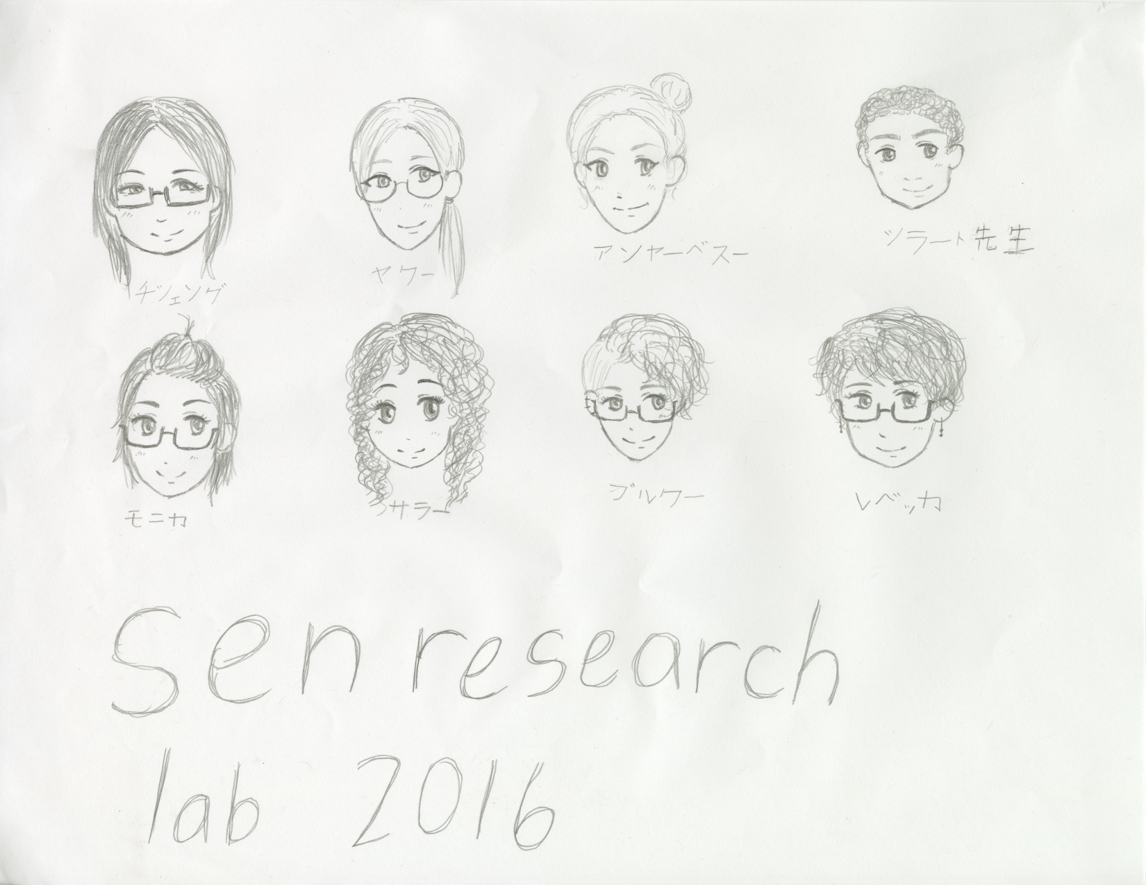
The development of this website was led by Shilad Sen at Macalester College in Summer 2016. The development team includes Brooke Boatman, Jaco Dippenaar, Rebecca Gold, Qisheng Li, Monica Ngo, Sarah Pujol and Anja Beth Swoap.
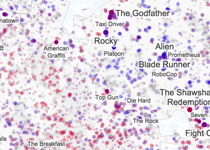
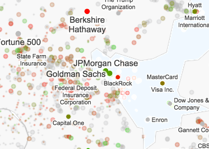
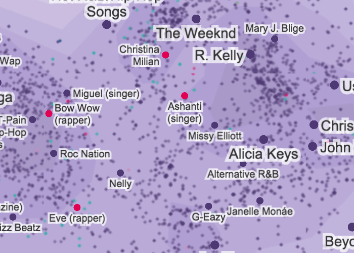
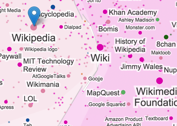
We are creating maps that visualize English Wikipedia in the form of real-world style geographical maps - with countries, borders, and so on. We want to create intuitive, interactive maps of information that facilitate exploratory search.
Search engines like Google are good for targeted search (e.g. "How does photosynthesis work?") but not as helpful for initial exploration ("Tell me more about the discipline of biology"). We want to translate a data problem into a visual problem: things that are close in meaning will be close together in the visual space, and geographical features will convey meaning as well - for example, an island might represent a group of data that are very distinct from all the rest.
The maps we make will allow people to explore information in a way that is familiar to them - geographically and spatially.
We start with raw, vectorized data representing Wikipedia articles, which come from Wikibrain. Each article is represented by a 100-dimensional vector that captures its relationship to other articles (via word occurrence and linking context). These vectors are then clustered using the k-means algorithm. These clusters later become the colored countries that are seen on the map.
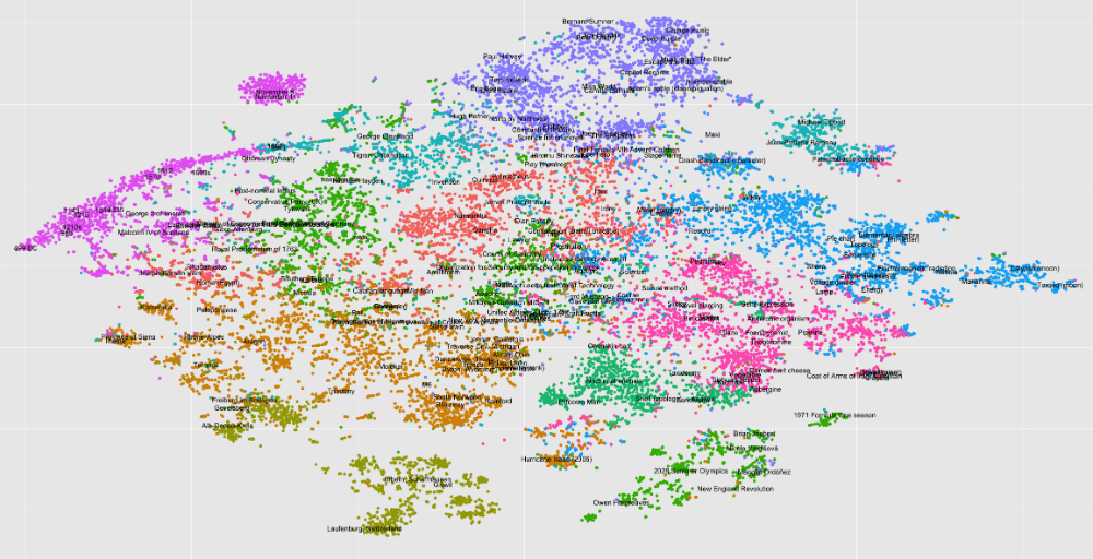
The next step is to move from 100-dimensional vector space to a 2-dimensional embedding that we can represent visually. We do this using tsne, which stands for t-Distributed Stochastic Neighbor Embedding. This looks something like this:
From there, we draw the country borders. This involves setting a "water level", which floods water points into the less-dense regions of the map, creating lakes and coastlines. Outlier points are thrown out before border generation in order to creater neater, more coherent countries.
Next, we generate the contours. There are two options: density-based, which is a straightforward contouring where the brighter areas represent higher density, and centroid-based, which draws the contours based on the center of a cluster in 100-dimensional space - the closer to the center the brighter the color.
The final generation step involves labeling the map. Labels are generally handled by mapnik, our mapping library, but we wrote the code to determine which labels show up as you zoom in, and also to determine their sizing based off popularity.
User interaction is done in Leaflet.js, a JavaScript mapping library with a wide selection of plugins to enable functions like search and interactivity.
If you'd like to know more or want to check out our code, fork us on Github!
Powered by: